

























What Evidence Matters More Than a Supplier’s Sales Presentation?
A Good Presentation Is Not the Same as Good Evidence. A supplier’s website, catalog and sales presentation are useful starting points. They can tell you

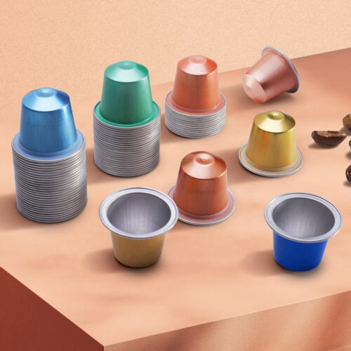
For a coffee brand with only one product, capsule color is mostly a branding decision. Once the product range grows to several SKUs, however, color can become a practical identification system.
A customer may see four capsules that have exactly the same shape but different colors and immediately understand that they represent different coffees. The same principle can also help warehouse staff, production teams and distributors identify SKUs more quickly.

For empty aluminum coffee capsules, color is particularly useful because the capsule body itself becomes part of the product’s visual identity. Instead of relying entirely on a printed label or outer box, the capsule can carry a simple visual signal.
For example, a brand could use:
There is no universal color standard that says one particular color must represent one roast or coffee origin. The important thing is consistency within the brand’s own SKU system.
The simplest application is to use color to distinguish major product families rather than every individual coffee.
For example:
| Product Family | Capsule Color Direction |
|---|---|
| Classic Espresso | Black / Dark tones |
| Medium Roast | Brown / Warm tones |
| Light Roast | Silver / Light tones |
| Decaf | Green / Distinctive color |
| Specialty Series | Metallic / Premium finish |
| Seasonal Series | Limited custom color |
This approach works particularly well when the brand has many SKUs.
Instead of creating a completely different visual identity for every coffee, the brand establishes a color architecture.
The customer learns the system once and can then recognize it across the product range.
For example, if every Decaf product uses the same green family, the exact coffee can change while the visual signal remains consistent.
Color can also be used to communicate product attributes, but brands should be careful about how much information they expect color to carry.
For example, a brand might organize its range like this:
Origin:
Blue = Colombia
Green = Ethiopia
Red = Brazil
Or:
Roast:
Silver = Light
Gold = Medium
Black = Dark
Or:
Product Type:
Standard color family = Regular
Green family = Decaf
Special finish = Limited Edition
The important point is not which system is “correct.” The important point is whether customers can understand it quickly.

A color system that requires customers to remember eight unrelated colors is less effective than a system built around three or four recognizable categories.
For that reason, color should normally support the information already provided by the packaging, not replace it.
Decaf is one of the clearest cases where color can help.
A brand may have several Decaf products with different origins or roast profiles. If all of them use a recognizable color family, customers can identify the product type immediately.
For example:
Green family = Decaf
Then individual Decaf coffees could use:
The colors are different enough to distinguish individual SKUs, but they still belong to the same visual family.
This creates a useful balance between SKU differentiation and brand consistency.
However, color should not be the only indication that a product is Decaf. The product name and relevant labeling should still clearly identify the coffee.
Using different capsule colors does not mean the brand needs to look inconsistent.
The key is to keep several elements fixed:
Then allow the capsule color to change according to the SKU.
For example, imagine five aluminum capsules:
Black / Gold / Silver / Green / Red
If the same Logo position, print treatment and packaging architecture are used across all five, the products can look like one coherent range even though the capsule colors are completely different.
This is why color should be designed as part of a brand system, rather than selected independently for each new SKU.
Color selection cannot be separated completely from surface finish.
The same nominal color can produce a very different visual result depending on whether the aluminum capsule has a:
For example, a metallic black can look premium and reflective, while a matte black may appear more understated.
Likewise, gold can move from a bright metallic appearance to a softer champagne-like effect depending on the surface treatment.
This is one reason why buyers should approve a physical color sample or defined color reference, rather than approving a color based only on a digital screen.
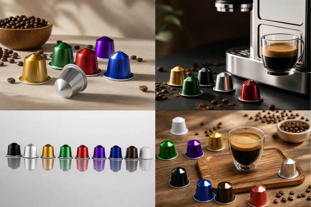
Screen displays, photography and factory lighting can all change how a color appears.
For custom colors, the buyer should also understand that the approved reference needs to be linked to the production specification.
Color coding is useful, but every additional color can also create another SKU to manage.
This matters particularly for smaller brands.
If a brand launches:
the potential number of combinations can increase quickly.
The brand therefore needs to ask:
Does this color help sell or identify the product, or is it simply adding another variation?
For high-volume products, a dedicated custom color may make sense.
For a low-volume experimental SKU, using an existing stock color may be more practical.
This is also where MOQ becomes relevant. A custom color may require a larger production quantity than an existing stock color. If the expected demand is low, creating a unique color purely for visual differentiation may leave the brand with excess capsule inventory.
In other words:
Color differentiation should support inventory strategy, not work against it.
A good color system should work not only with today’s products, but also with the next 10 or 20 SKUs.
Before choosing colors, a brand can ask:
This last question is important.
The capsule is only one part of the visual system. The lid, Logo, outer box and shipping/retail packaging should support the same hierarchy.
A well-designed system might use capsule color for quick recognition, the lid for brand reinforcement, and the retail box for detailed product information.
For buyers developing a multi-SKU aluminum capsule range, color should ideally be discussed before production rather than added at the last minute.
The manufacturer needs to know whether the buyer wants:
The production strategy can then be planned around the actual SKU structure.
For example, an order with several existing stock colors may be easier to organize differently from an order requiring several custom colors.
For customized projects, the practical question is not simply:
“Can you make this color?”
It is:
“Can you reproduce this color consistently across the required quantity and repeat orders?”
That is the question that matters when the color becomes part of a long-term SKU system.
Final Takeaway
Color coding can make a multi-SKU coffee capsule range easier to understand, but it works best when it follows a clear system.
For empty aluminum coffee capsules, a practical color strategy should balance four things:
Brand identity + SKU recognition + production feasibility + inventory control.
Use color to communicate meaningful differences such as roast level, Decaf, product family or limited editions. Keep the number of core color groups manageable, maintain consistent Logo and packaging rules, and make sure custom colors are evaluated not only for appearance but also for repeatability and MOQ.

The strongest capsule color system is not necessarily the most colorful one.
It is the one where a customer can look at the capsule and understand what it is, which product family it belongs to, and how it fits into the brand—without the brand creating unnecessary production and inventory complexity.
Authoritative Sources & Further Reading

Coffee Capsule Manufacturing Specialist · Kervoo
Since 2024
A Good Presentation Is Not the Same as Good Evidence. A supplier’s website, catalog and sales presentation are useful starting points. They can tell you

For a coffee brand with only one product, capsule color is mostly a branding decision. Once the product range grows to several SKUs, however, color
An aluminum coffee capsule can leave the factory looking perfectly fine and arrive at the destination with a different problem: a few rims are bent,